Rules of Photography pt.2

TOPIC: Music

RULE OF THIRDS
This photo is rule of thirds because the microphone is most definitely the main
subject, but it's not super boring or mainstream since it isn't directly in the middle of the photo.

LEADING LINES
The strings of the guitar are the leading lines in this photo, making them the
main focus of this photograph. While everything else is blurred they are focused on.
SYMMETRY AND PATTERNS (repetition)
This photo shows the set up of a stage during a concert. As you can
see the screens and lights they installed and set up are symmetrical giving it
not only an enjoyable view, but balance.
FRAMING
There isn't much music shown in the photo, but if you look closely there
is a concert going on on the small stage on the baseball field. I REALLY like the
framing in this photo- having the whole stadium as a huge frame to the small stage is a
perspective that I found very unique and creative.
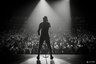
SIMPLICITY/BACKGROUND
I chose this photo for this composition because the subject isn't just against
a plain background, but there is action occurring. But your eyes still go straight to the singer
in the center of the photo, making it the subject of the photo, blurring out the rest of the photo.
BALANCING ELEMENTS
This photo was pleasing to my eye because it was balanced out
by the two people on either side of the middle person. There wasn't an odd
number making it look awkward.
DEPTH
This is not the best example of depth composition, but I think it could
pass because you have three different sections in this photo-
The stage where the band is, the lead singer at the front of the stage, and then the crowd.
This gives a little more to the photo than if it was just of the singer and everything else was blurry.

AVOIDING MERGERS
In the photo to the left, the photographer obviously did not focus on what the photo might look like from
that perspective, only to eventually find a microphone coming out of the singers ear... The photo on the left is an 
example of avoiding mergers by taking the photo from a different perspective so that the microphone stand would not
somehow be attached to his body.

VIEWPOINT
This photo was taken at an above perspective, making the figures look like
they are doing something that isn't as normal. The photo looks really cool and humorous to me.
CROPPINGThis photo is from Taylor Swifts "Bad Blood" music video.
There is a whole line of girls, but they wanted the viewer to focus on Taylor,
so they cropped most of the other girls out of the photo so that your focus would go straight to Taylor.

Comments

Popular posts from this blog

Academic Shoot

Front Pages of the World

5 websites